This story first appeared as part of WFAE's EQUALibrium newsletter, exploring race and equity in the Charlotte region. Get the latest news and analysis in your inbox first by signing up here.
Inequalities in our community show up in a number of ways — and you can see them on a map. And while the lens of data can feel abstract and impersonal, looking for patterns can help us spot and understand inequality in a more quantitative, less anecdotal way. And, maybe most importantly, seeing those patterns can help us ask: Why are things this way?
In this week's EQUALibrium newsletter, we took a look at three data sources that show inequality in unexpected ways in Charlotte, and some of the factors that have led us here. I’ve included links so you can explore more on your own.
Let’s start with this baseline: Charlotte’s familiar crescent-and-wedge maps that reflect the historic racial and income segregation in our communities. You’ve probably seen some versions of these:
By now, the story of how we ended up with those maps is fairly well-known. Legal racial segregation and the subtler influence of redlining that restricted financing for many neighborhoods set the template for racial segregation, which has persisted and compounded even in the decades since those laws and policies were reversed.
Here’s how those same patterns show up in other, maybe less-expected, places.
Pollution
Here’s a map of EPA-regulated pollution sources, including air and water pollution (You can dig into the interactive map online):

These pollution sources are clustered in low-income, largely minority neighborhoods north and west of uptown. Very few are in southeast Charlotte.
Many industrial facilities that discharge pollution are clustered around highways and rail lines. Those were historically more likely to be built through low-income, Black neighborhoods — neighborhoods that had less political power to push back.
Explore more: The Environmental Protection Agency’s screening tool lets you create custom maps of different pollution sources, and superimpose them on areas where there are higher-than-average rates of asthma, heart disease and other health conditions. (Hint: There’s a lot of overlap.)
Speed bumps and stop signs

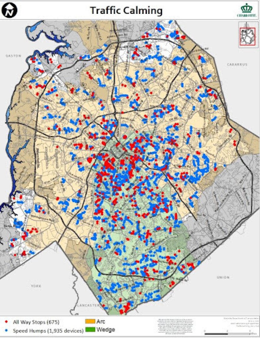
If you look at where the city of Charlotte has placed traffic-slowing devices like speed bumps and four-way stops, you’ll notice a pattern: Many of them are clustered in the wealthier southeast “wedge” of Charlotte.
So, does this reflect where the city sees the most traffic injuries? Nope — in fact, that map looks almost like an inverse image of the first:

So, what’s going on? One issue is the way traffic-calming devices were historically installed. Until Charlotte City Council repealed the rule last year, the city required people requesting a traffic-calming device on their street to get a petition signed by 60% of all homeowners within a 1,200-foot radius. And since home ownership rates are much lower in some parts of the city than others, that meant residents in low-income neighborhoods with mostly renters faced a substantial obstacle to even request a speed bump or four-way stop. (Try collecting signatures from an out-of-state corporate landlord who owns your neighbor’s house.)
Tamara Blue, Charlotte Department of Transportation community relations manager, said at the time that the system was “written for homeowners and property owners.” And when homeownership rates reflect other longstanding inequities, then a traffic safety policy based around homeownership will end up reflecting them as well.
Explore more: You can see a wealth of interactive data, including which streets have the most injuries in Charlotte and where stop signals are located, on the Charlotte Open Data Portal. (Click “Layers” and see what’s on offer.)
Heat
On a scorching hot day, tree cover makes a big difference. On average, the EPA says shaded surfaces are 20-45 degrees cooler than those in the sun, and air temperatures are 9 degrees cooler under mature trees than in open air. And as climate change heats up, those benefits are going to be more and more crucial.
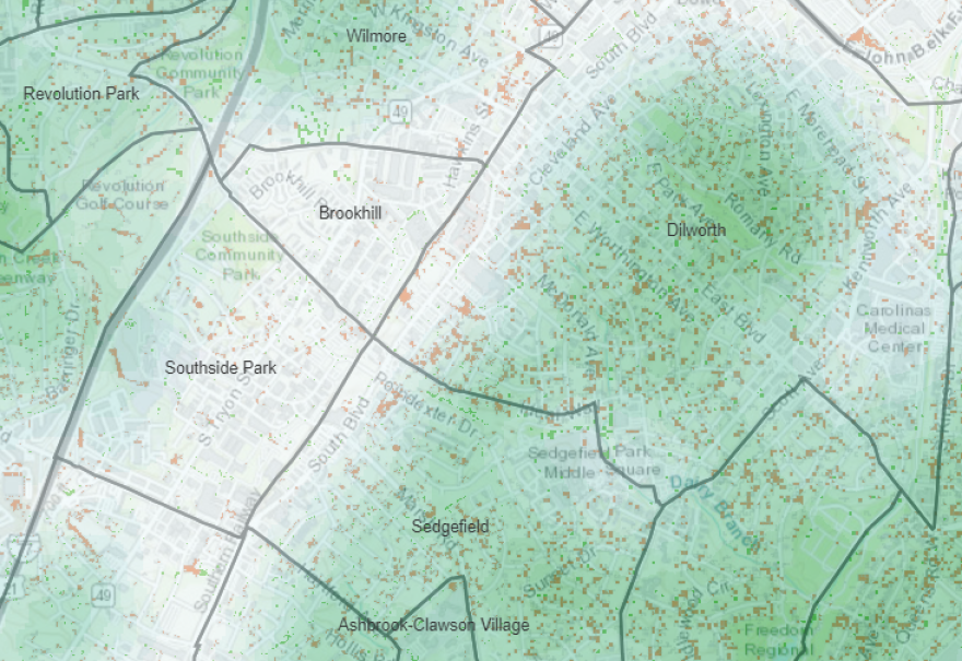
In Charlotte, we’re lucky to have a pretty good tree canopy, covering nearly half, or 45%, of the city. But it’s not evenly distributed. There are big differences between neighborhoods. For example, look at the tree canopy in Dilworth and Sedgefield versus Southside Homes/Brookhill Village. The low-income housing projects to the west of the train tracks have drastically less tree cover.

This pattern repeats in other neighborhoods — check out the difference between Lockwood and Tryon Hills and Plaza Midwood.

The root causes trace back to many of the same factors we’ve looked at already. Most of Charlotte’s tree canopy is on privately owned, residential land, and in many cases, higher-income neighborhoods have more trees. What that means: Someone walking in Brookhill or near the Southside Homes is going to be a lot hotter than their fellow Charlottean walking a few blocks away under the shade.
Explore more: You can see an interactive map of tree canopy in Charlotte compiled by researchers at UNC Charlotte. (The data is from Charlotte’s most recent tree study, which ended in 2018. The city plans to update that study in the next month or so, officials have said.) The New York Times has a great feature about why there are fewer trees in poorer neighborhoods nationwide. And you can read WFAE reporter Lisa Worf’s excellent exploration of how this issue is playing out in Charlotte’s low-income Corridors of Opportunity as well.


